There are so many things that can influence the feel of a space. How much light it gets, how cluttered or clear it is, visual complexity, the list goes on. Something that can have a very strong psychological impact on the feel of your home is how you use colour.
That being said, it’s an element of interior design that a lot of us simply aren’t well versed in. While guesswork and intuition can get you a long way, it’s also nice to feel informed. With that in mind, let’s explore the three main psychological and aesthetic categories of colour – warm, cool, and neutral.
Warm Colours
Warm colours can be used very effectively to create a homely, comforting atmosphere. You can go slightly darker in bedrooms, to keep the energy low and cosy, and then go slightly brighter in dining rooms and work spaces where you want to feel energised. It’s important not to overdo these colours – they work well in moderation, but can become overpowering.
Reds
Many of us will associate red with romance and passion – dark reds can also be used to create a sense of calm opulence, well suited to more traditional dining rooms.
Orange
Orange is often thought of as a creative colour. It can be a wonderful addition to a home, but it can also be slightly harder to integrate than red, so be careful.
Yellow
Last on the warm list, yellow is often thought of as an energetic, happy colour. It’s subtle and can be easily integrated into a wide range of different spaces.
Cool Colours
Opposing the warm colours, we have the cooler shades, often adopted for their calming effects. These colours can work well in spaces like kitchens, bathrooms, and home offices, although you can obviously take them wherever you like.
Blue
Blue is one of the most versatile colours in interior design. Lighter shades can be used to create a happy, light space, while darker shades can create a sense of grandeur and depth.
Green
Green is sometimes thought of as a warm colour, but we place it in the cool camp. It’s refreshing, bringing a sense of nature and harmony to the home.
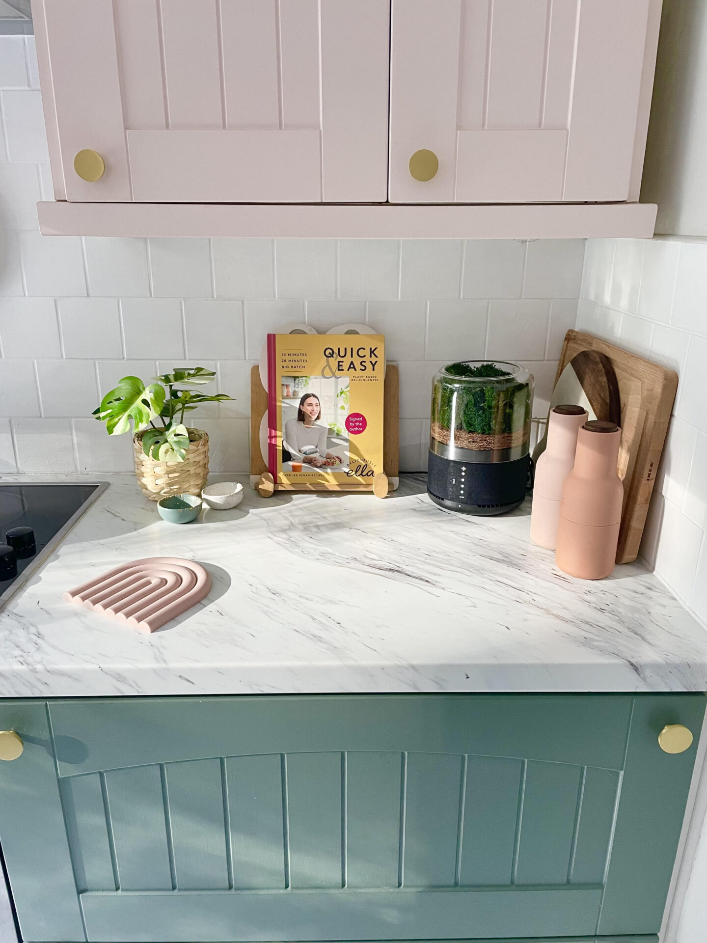
Neutral Colours
Lastly, we have the most versatile colours – the neutral shades. These can be used pretty much anywhere with high levels of success. In addition to wall colours, you can bring in neutral shades in pieces of decorative homeware from artisans like The Sculpts.
White
White is the most common colour in most homes. It allows you to project whatever you want onto it, without dominating the space, and it’s incredibly good at optimising natural light.
Grey
Grey can be used to create a slightly more modern, cool effect. You’ll want to be careful though – if you’re going for a comforting aesthetic, you’ll need to integrate other stylistic elements as well to achieve that effect.
These rules do not have to be followed all the time – everyone reacts to colour in a different way, and these are just general guidelines. However, if you find yourself stuck, these simple tips should provide you with a good starting point.
Post in collaboration.
Follow me on Facebook | Instagram | Pinterest | Twitter


While everyone has their own style there are a few things to keep in mind that are universal when decorating your lanai.